Wednesday, September 28, 2011
HD in gallery 100 show Review. Connor McShane
Besides the feeling of disorganization, and no connection between the multiple works within the gallery, alone each piece was very successful and altogether the show left an impression within my mind.
Friday, September 23, 2011
A trip to the Phoenix Art Museum
But this sculpture Untitled was the opposite. It was small, and austere. There was nothing that would make a viewer get that instant "Wow" moment as most of Nevelsons other works would, yet something about it held my interest. Its title I felt was fitting because the subject matter itself was uncertain so how could a person give it a full title. It appears to be a representation of a human figure. But is he resting, or ready to get up and go some where? I think that is what I like most about this piece. It is mysterious and I (the viewer) am able to continue the story of this figure.
- Tina O.

Bisque Without Borders
 I went to the Ceramics Research Center and saw the Bisque Without Borders exhibit. It was incredible because of all the detailed pieces involved. The intricate detailing drew you into the pieces individually and as a whole. They really made you look at each piece carefully. I loved that each thing had so much to offer when looking at it. It made me think about many different things. I constantly thought about what the artist was thinking when he made the pieces. I would highly recommend that everyone check this out.
Thursday, September 22, 2011
Shining CIty


I also went to the Shining City MFA show. I found it a very intriguing collection. The point I felt the artist was trying to make was very obvious as to how it relates to real life. The artist talked about how the government keeps telling people to support the US by continuing to buy stuff in order to help the economy. His point was that as people are doing this, they neglect to see the monster that is ravaging their cities. He showed this through a "window" in the back wall through which you could see a monster made up of commercial businesses attacking the city on the hill. I really enjoyed the message and the way the artist created the way to portray it.
ShiningCity: An MFA Thesis Exhibition by Sebastian Wittig

I decided to visit Sebastian Wittig's ShiningCity exhibition for this weeks review. It was a lot different than most exhibitions I've seen in the Harry Wood Gallery and it deals with propaganda that is being used as distractions to cover up social issues that go on in the world. It is set up just like a convenient store with items for sale. Each item represents a "distraction" and the price is a date related to that social issue. I grabbed a product guide that explained every product in the store. For example, one of the products was called MeXoBlamin. The product guide description states:
"We are in the news with one of the biggest distractions of the year. When an unelected governor has no track-record and stands for election, there's an easy way out: it's the Mexican's fault, those illegal invaders who take our jobs, steal our stuff, and... mow our lawns.
The amount of verbiage that we were bombarded with was amazing. Illegal Canadians were to be targeted as well, we were told. Navajos, on the other hand, were exempt.
The governor was elected. For the first time."

Wednesday, September 21, 2011
Elise Deringer: Perception and Passage

For this week's art exhibition review, I am writing about Elise Deringer's show in the Harry Wood Gallery on ASU campus. Elise is a graduate student studying fibers, and this was her thesis show. I took some time before the class visited her show to view her work on my own. She joined the use of silk fabric and various combination's of salt, sand, concrete, and spices to create individual pieces that cohesively fit into the entire show. Elise elaborates on what her thought process was behind her work in her artist statement. She says her work is "... a record of a few small steps on a long path, and left open for understanding.".
Structurally, the pieces evoke a soft and ethereal tone. They are hung in various ways. Her piece titled "Metamorphosis" forms a wave pattern that creates an intriguing three dimensional movement. This was also my favorite piece of hers, as she created cyanotypes (using sunlight to develop an image on a surface) on the silk. Her pieces, as a collection, make up various forms of nets, containers, and filters. Her use of silk in order to construct these forms is very impressive, as silk is a soft, delicate fabric. I like how this quality contrasts with the sturdy, supportive forms they make up.

Tuesday, September 20, 2011
Ceramics Research Center

Tuesday, September 13, 2011
Once upon a time...
 |
| Longing for the Butterflies pen and ink and watercolor |
 |
| There is No Magic |
 |
| Monster Money pen and ink and watercolor |
 |
| Character Sketches charcoal and eraser |
Five Creations
Monday, September 12, 2011
Examples of My Art
I tend to not
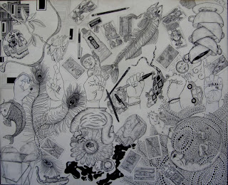
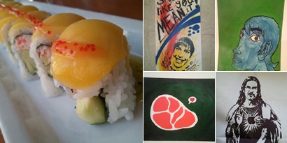
take photos of any of my art (I was lucky that my phone automatically saves photos I’ve taken to a private folder on my Windows Live SkyDrive, so I didn’t have to do much of anything [Yay laziness!]). That statement is a little odd since I do love taking photos (especially using the macro setting on my Windows Phone like the photo of the mango lobster rolls from Ra Sushi). Most of the time I do graphic design, mainly using Photoshop, but lately I have been doing a lot of work wowing people with PowerPoint slide decks. The other four pieces were done last semester between my Color and 2D Design classes. My favorite is my “iProphet” print followed by my self portrait.-For those wondering, I used Windows Live Writer to write this post as well as create the album above. If you have any questions, ask me in class and I can show you.
Sunday, September 11, 2011
Connor McShane
Marker on Vellum. Also done 1 1/2 years ago in a design class.
Acrylic on Linen. Done 3 years ago. Just for fun.
Digital photo-montage, creating space and time with a 2 dimensional plane. done this year.
Saturday, September 10, 2011


 Architecture can say so much about our history. This Holocaust memorial in Berlin is what started my interest in architectual photography.
(1) This particular art piece never received a title, but it has remained one that I've felt most proud over. The story behind this piece is just as insignificant as the picture itself. Basically, it was a random Friday summer night and I was bored and felt like drawing something. So I went looking for a pencil and found a princess pencil in my little sisters room. Then I found a picture from an Alternative Press magazine and went to work. I drew all through the weekend. I was really impressed with myself when I was done because I have never drawn a human figure so realistically before, so this was a huge break for me!!!
Friday, September 9, 2011


I love to write stories. Most of the art I do is based off of the stories I am currently writing or plan to write. These are all from different stories. I find that with pieces like these I like to try to capture the emotion of an event by showing what was left behind, in particular the prison bars picture. For the most part I just like experimenting with different mediums and techniques to find out different ways of doing things. I usually don't create things with full backgrounds. I like to doodle more that create fully completed pieces. I have also noticed that I tend to really like to create pieces that can change and develop as they are completed. I guess overall what I am trying to say is that stories are what tend to inspire me the most and I find it helpful to draw things out to help increase my inspiration.
 A pastel collage I did in my drawing II class. This same unicorn appears in a lot of my drawings.
 A picture of a giraffe that I drew during my Drawing II class last semester using colored pencil. I drew this picture for my friend in a similar style that she paints in.
 This is my first painting that I entered into the Amazing Ink art show last year and was shown in an article for the Phoenix New Times.
 This was my first charcoal drawing of a still life that I did about a year ago in my Drawing I class.


